 We are often asked about the average lifespan of a staffing website. The answer in short is, it really depends on a number of factors, including the immediate goals, the technology in place and the design, but a long-held belief in the industry is, on average, about three years. The look and feel of the web is constantly evolving at a blistering pace. How do you keep your firm’s site from falling behind? That’s easy: Keep up with the trends.
Almost halfway through 2018, it has become easy to see what is working for staffing websites and what is not.
Imagery. Your website’s imagery sets the tone for the experience, be it photography, illustration, patterns, gradients or lack thereof. It really serves as the first impression that a visitor gets from your company and can either pull them further into the content or drive them away entirely. We’re aiming for the former and definitely not the latter.
In terms of photography, natural is in. Gone are the days of over-posed stock photos like the ubiquitous handshake shot or the dreaded four-way high five. Instead, it’s now all about big and bold imagery of realistic models in realistic situations, and if stock photo people aren’t your brand’s image, then scenery can work well too.
Illustration is another very popular direction for websites to move in. These images are versatile, striking and a way to stand apart from your competitors. Vector illustrations also have the potential to be easily customized and set up to match your brand in order to make them feel truly at home.
PREMIUM CONTENT: GDPR – Frequently Asked Questions
Color. The use of color on a website not only goes a long way in setting the tone, but also in directing the user to where you want them to go. The use of color can help make a site memorable, whether it sticks with the current trend of a vibrant palette or isolates color through the use of a black and white or duotone scheme.
Strong color choice will make calls to action obvious and can help direct the viewer’s eye to important content. Palettes do not need to be confined to your brand’s logos and introducing complementary secondary or tertiary color choices can help keep things fresh.
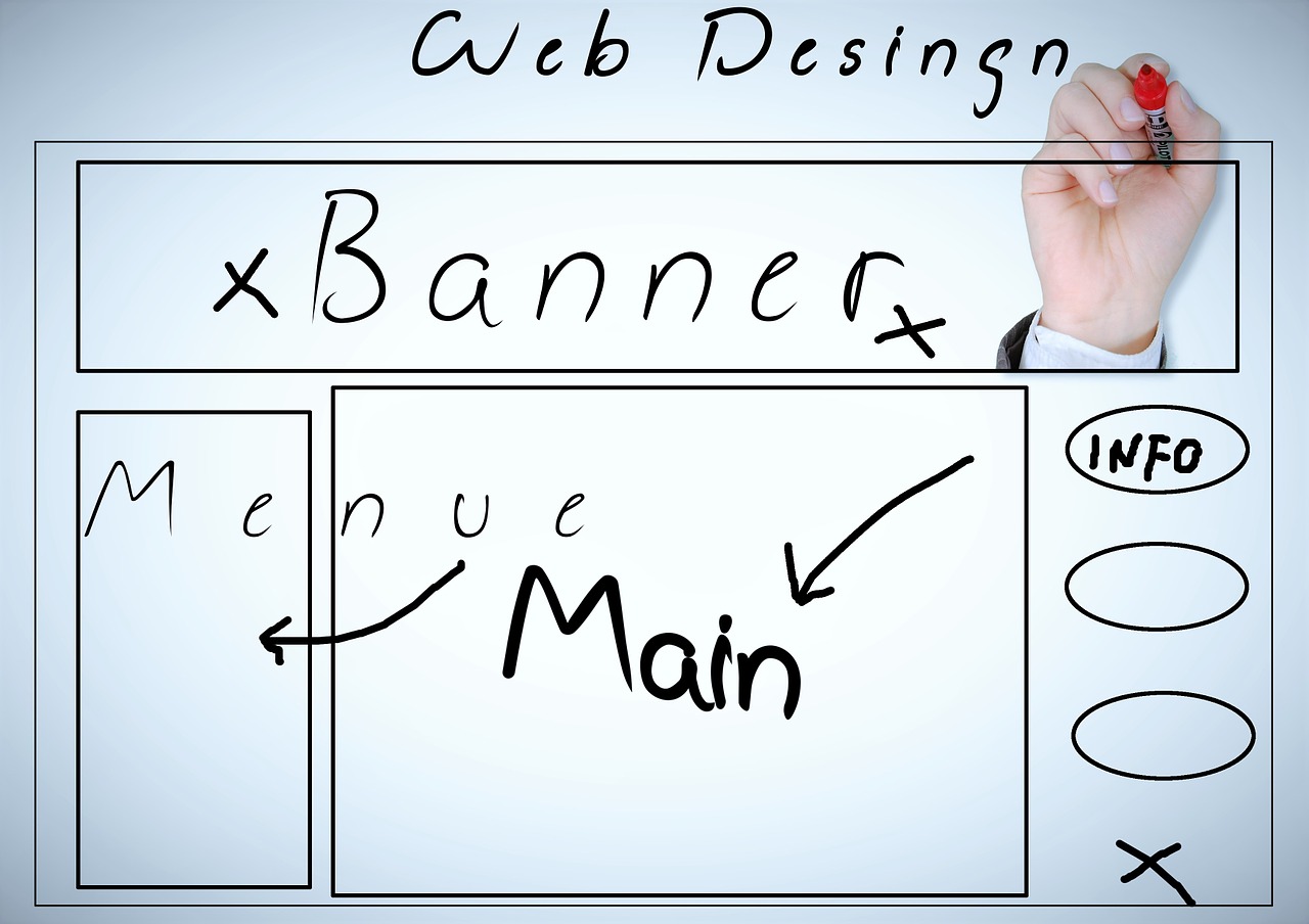
The Grid. It is no secret that many websites today can look very similar. You know the look. It starts with a navbar over a large hero image with three columns of short copy below that and so on and so forth. This look, made popular when Bootstrap introduced its framework and made it very easy to create, is seemingly everywhere and can lead to many different websites looking very similar to one another. How can we get around this? By breaking the grid.
New techniques and increased adoption across the web are now making it easier to create layouts that stray from the traditional mold in order to create unique and memorable websites. This is aided by the use of imagery and color as well as bolder typography.
Modern styling can speak volumes about your firm’s commitment to staying up to date with your industry, your clients and your candidates. Keeping your website’s look on-trend is an important step toward staying top-of-mind with clients and prospects and help extend the life of your online presence.
MORE: Email marketing delivers staffing ROI